Saturday, 12 May 2018


EVALUATION QUESTION 1 : IN WHAT WAYS DOES YOUR MEDIA PRODUCT USE, DEVELOP OR CHALLENGE FORMS AND CONVENTIONS OF REAL MEDIA PRODUCTS?


TRAILER ANALYSIS
The production logo is in conventional place at the beginning. Toxic
symbol in background is symbolic for zombie genre, therefore horror. Red and
white has connotations of panic. Film4 afterwards shows it helps and finances
independent British films, this is conventional.
Fade to black and then 5 (5th of November) shows
on screen, part of the brand identity. Shot of the moon, which has connotations
of werewolves and horror. Symbolises the night, conventionally the most
dangerous time in horror films. Moon is over a suburban neighbourhood, the
typical slasher location. Glitch in the opening cards, suggesting within the
plate shot at the beginning that there is some disruption, that something will
go wrong on the 5th of November. The entire narrative is echoed in
the opening plate shot.
Black/red/white is conventional colour palette for horror. Next
plate shot is 4 (best friends). The countdown of numbers builds tension, which
trailers are designed for. This reinforces the brand identity, and by the end
of the trailer the 5th of November date will be familiar.
The characters are introduced with laughter, lightens the
mood and tension already built up. Fire is shown between the couple at the
start. Foreshadows the dangerous connection. This is developing the shot from Jaws, in which a couple kiss, composed in front of a fire in the background, which foreshadows a dangerous relationship.
Then
a fade to black which is a convention of trailer form. This shows that the
events are not happening in the same time frame.
3 suspects is the next plate shot, which reinforces the
conceit of the countdown which shows narrative elements. This also reinforces
the brand identity. In the next shot, the fire is even bigger, and the fire
overtakes the place in the frame where Alex is sitting, therefore showing that
he is on fire, foreshadowing. Promiscuous girl has a low cut top which
reinforces her character trope. Stoner boy is smoking which also reinforces his
trope. Shows they are rebellious. Conveys the idea that those who rebel get
punished. Shows that the characters are at the age where they experiment with
transgressive rebellion. Next frame reinforces the idea that the fire is
separating them.
2 sides to a story implies the equilibrium is about to
shatter, and a problem is going to occur. A scream and the banging on the wall
and the sound of fire. Production can’t afford to set the area on fire,
therefore we had to make do with using the sound of crackling fire to convey
that idea. 1 deadly secret is the enigma code, the audience asks themselves who
will die and who will survive.
High angle shot of the group running down the stairs. The
extreme angle at which the shot was composed creates unusual angular
composition, reminiscent of German expressionism and how it fed into the horror
genre. This angle is disturbing, it’s not an angle we see usually. The shot
reflects the disruption in the narrative. Matched action of the group running
through a door. The composition is placing all of the vertical lines as visual
barriers. Somewhat maze like, the barriers prevent her escape, compositionally
speaking.
 Cuts to another unusual angle, in which the shot takes place
from a low angle on the floor. Fire extinguishers and fire alarms are on the
door, which reinforces the idea that fires should be put out, and fire is what
they are running away from. Visual irony, as that is what they need. Sickly
green colour on the walls convey illness within the frame. This is in reference to the colour palette used in Hitchcock's Vertigo, in which the sickly green and earth brown colours were used to convey an uneasy, queasy atmosphere. Edits quicken
as a montage edit.
Cuts to another unusual angle, in which the shot takes place
from a low angle on the floor. Fire extinguishers and fire alarms are on the
door, which reinforces the idea that fires should be put out, and fire is what
they are running away from. Visual irony, as that is what they need. Sickly
green colour on the walls convey illness within the frame. This is in reference to the colour palette used in Hitchcock's Vertigo, in which the sickly green and earth brown colours were used to convey an uneasy, queasy atmosphere. Edits quicken
as a montage edit.
Frame is split in half. The door symbolises safety / a way
out, and it is reflected on the bottom half in which the door is ghostly
resembled. Camera moves with her and is handheld, typical in the slasher genre
– documentary realism and emergency. Upstairs corridor shot of the killer
walking – two fire extinguishers are on the left of the frame, they are
prominent within the frame. Only showing his legs maintains the enigma and
reinforces the mystery behind him. Matched action as we now see the killer’s
weapon. Mask + weapon combo is conventional in the horror genre. Shows us he is
the villain. He is surrounded by the sickly green / illness colour, conveys who
he is.
He looks down at the group below bathed in red light –
connotations of danger. Over the shoulder shot, shows him as being powerful and
them as being vulnerable. Shown in a theatre, this is like a theatre
performance to him. Could be linked to a theatre of conflict, or an operating
theatre. The two in the group break away from their embrace, but visually they
are trapped. High pitched music reminiscent of psycho.
No escape on another plate shot, a reinforcement of the
brand identity. The group were shown trapped in a frame, and then it says “no
escape”, which reinforces the idea that they’re trapped.
As he watches them in the common room scene, the fact he is
stalking them and watching through a window is conventional in slasher films. Another
plate shot “FROM THEIR SINS”.
Next scene is final girl running into the hall stage. She’s
trapped in the frame visually from a metal bar going along the centre of the
frame. She takes the fire extinguisher in an attempt to beat the killer. She
wore black when she was a rebellious teenager, but now she’s wearing white
which shows a binary opposite between innocence and rebellion. In the stage
shot she is in white surrounded by black. She looks up into the light as if she’s
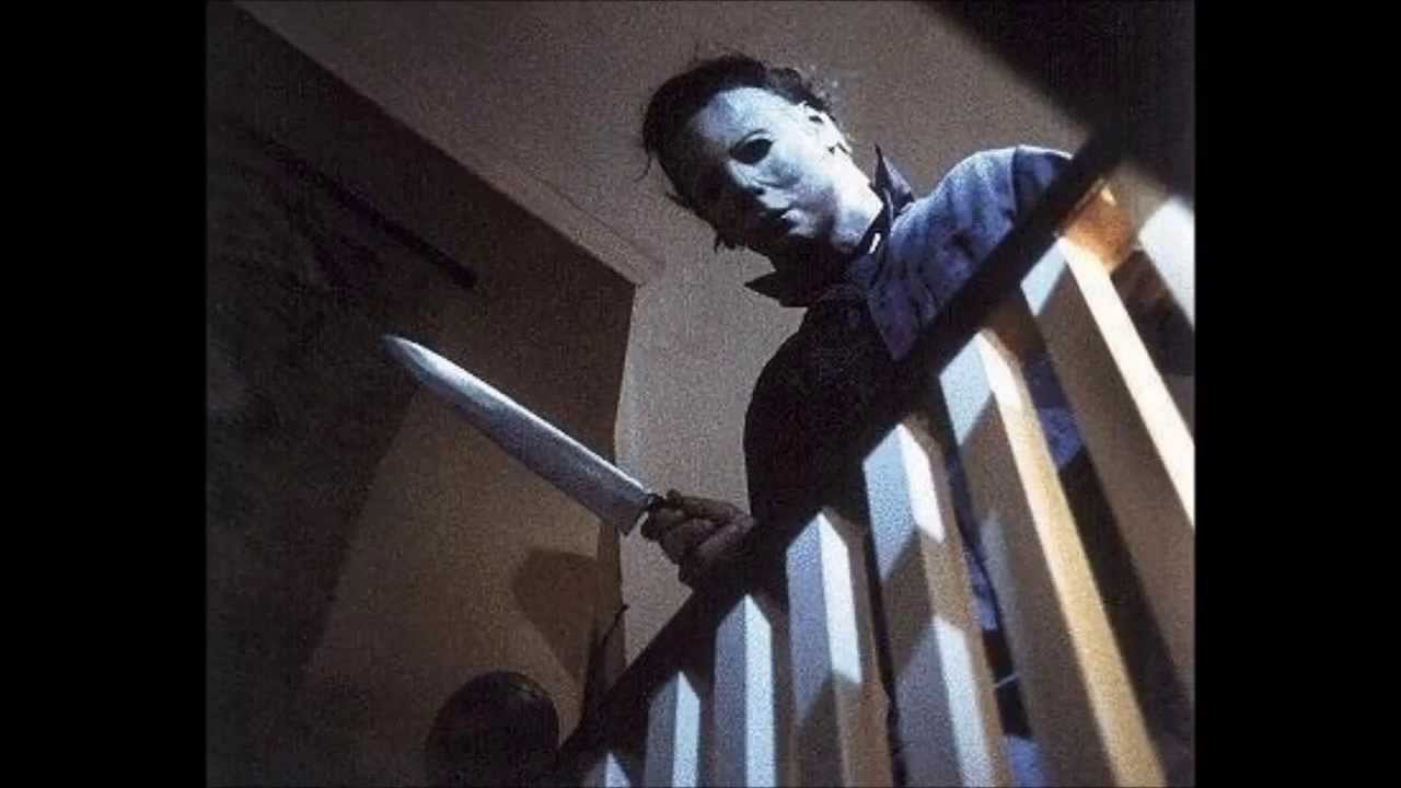
looking towards the light at the end of the tunnel in death. Low angle shot of the killer on the rafters is
reminiscent of German expressionism and Fritz Lang. This shot conveys the killer as a powerful figure, and it was inspired by the famous shot from Friday the 13th, in which Michael Myers stood menacingly above the girl, staring down at her.
Pace increasing as part of the montage sequence, formally
conventional. She is visually trapped behind a pole. There is art of a brain in
the background, it shows she is trapped inside her own brain, in front of the
brain art but behind a pole / curtains. Inside a damaged brain. He jumps down
from his position of power, and the fire extinguisher is behind him which
reinforces the fire theme. Handheld camera shot of her running away which
reinforces urgency and immediacy. She runs through doors, which is a visual
metaphor for the hidden depths of the subconscious. The shadowed silhouette of
the man is conventional in horror / slasher films.
She falls down in front of a blue door, which has
connotations of freedom, which could suggest that this particular door could be
her salvation. Then the film title plate is shown, utilising the idea of a
circle of fire / Catherine wheel ‘O’ in “Bonfire Night”. Trope in slasher films
to name it after significant days of the year e.g. Halloween, Friday 13th.
Release date is 5th of November, which reinforces the theme. It is a
different plate shots to show that this is real life now, not part of the
narrative universe anymore. Principle cast and crew and tag line shown at the
end, conventional end to have this at the end of a trailer.
Friday, 11 May 2018
EVALUATION QUESTION 3 : WHAT HAVE YOU LEARNT FROM YOUR AUDIENCE FEEDBACK?
Here is how the initial survey I distributed at the start of the year helped me construct the trailer :
PLANNING : STORY BOARD
This is the story board planning sheets for my trailer. It is a guide as to what each shot should look like, as well as what type of shot it should be. It also includes a guide as to what sound should be played and also any captions / dialogue.
This is important for the trailer as it makes it easier and less stressful when shooting because we know exactly what to aim for.


This is important for the trailer as it makes it easier and less stressful when shooting because we know exactly what to aim for.
IMPROVING BRAND IDENTITY
Over time I realised the typography for my poster and magazine cover were not the same as the typography at the end of the trailer, therefore I had to change my fonts. I went back and used exactly the same typography as the plate shot at the end of the trailer.

This was to reinforce the brand identity and to show that they are all marketed for the same film.


PLANNING : SYNOPSIS
4 friends are meeting up around a bonfire on the 5th
November. These include; Faith Richards – the promiscuous girl, Alex Martin –
the lover turned killer, Scott Chegg – the stoner / comic relief and Lucy Jones
– the innocent/final girl. Faith dares Alex to go into the shed for ‘7 minutes
of heaven’ with Lucy. Lucy is not too sure about this as she is not as
promiscuous or loose as Faith, and therefore lets Alex go in on his own.
In a frenzy, Faith accidentally tips over the bonfire and
fire begins to spread. They try to get Alex out but to no avail, and they have
to run away whilst he screams for help inside the shed. They believe he has
died, and no one speaks about it again, out of guilt and shame.
A year later, on the same day, the 5th of
November, the group are sitting in their college’s common room. As they are
conversing with one another, a masked figure jumps into the room and scares
them, but its revealed to only be Scott playing a prank on them. They all laugh
about it and go back to their discussions, however as they are talking, they
notice a masked figure standing at the window holding a metal bar. He begins to
walk towards the door as Faith exclaims “That’s not Scott! That’s not Scott!”.
The group spends the next few weeks afraid, as they believe
figure is coming to kill them. Eventually they find out that the killer is
Scott, back for revenge after they left him for dead. He developed major
scarring on the face, hence he wears a Hessian bag for a mask to cover his
face. He returns again, this time chasing them into a theatre. They sprint down
the stairs to avoid him, as he watches them from above. Alex fails to kill them
all, but manages to attack Faith, and she dies from her injuries.
They continue to be weary, and they tell a police officer
about their stalker, but to no avail, and he believes there are bigger
problems. Faith turns up to college the next day to find Scott died in his
sleep, murdered by an unknown suspect. She knows who did it, but the police
force do not help her. That day she walks through the empty corridors after
college has closed, staying after to speak to a teacher about everything that
went wrong.
As she walks through the corridors she hears footsteps behind
her, and she runs into the school hall, and attempts to hide inside the
curtains. She looks up and finds him above her on the rafters, rattling his
metal rod against the gating. She runs into another room and tries to stay
quiet, but her screams still come out. He tracks her down and manages to get
his hands on her, but she darts to the side and swipes the metal pipe from his
hands, and snatches it from his grasp. She hits his legs with it as he falls to
the ground, she unmasks him and asks why he did it, why he killed all her
friends. He tells her that they ruined his life by locking him in the shed and
leaving him to burn alive. She calls the police and tells them she has him
here, but they laugh it off as a silly prank call and they hang up. Whilst
she’s on the phone, Alex jumps up and sprints out the door. He turns around to
smile evilly at her as he runs into the night. Lucy falls to the ground and
bursts into tears.


RESEARCH : TRAILER ANALYSIS - HALLOWEEN RETURNS
Here I am going to analyse the sound. mise en scene, editing and camera work from the 2017 horror movie trailer, Halloween Returns. This is so that I can get an understanding of and recognise the forms and conventions of horror trailers, so that I can use and develop them in my own work when I construct my own slasher trailer later in the unit.
This trailer was from YouTube, therefore edited for all ages
and audiences.
It begins with an establishing, low angle shot. It shows a
suburban street which reminds the audience that it is Halloween. The street
lights are not at full pelt which shows a scary, imposing atmosphere. A figure
walks in the middle of the road with a flashing red light behind it, which has
connotations of death, anger and murder. The shot fades to black, and then
fades into the next shot, this is a common convention in horror film trailers
because it shows a slow-paced start,
The next shot shows the figure to be a girl, evidently just
killed someone, with a car following behind her. She exclaim “I killed him”.
This usually takes place at the end of slasher films, therefore this is
unconventional. The breaking of conventions makes it more interesting and engages
the audience more, as it is something they haven’t seen before. It fades to
black again.
The handheld camera suggests urgency and documentary
realism, therefore plunging the viewer into the dangerous cinematic universe in
which this narrative is taking place. An elliptical edit shows the previous
screaming girl taken to hospital, which is the only equilibrium we see, this is
another unconventional part, as the final girl is usually not shown to get to
this point, the films often stop just as she starts to escape. The lightning
and rain in the window are conventions of horror films, they have connotations
of fear, power and pain.
The trailer is punctuated with piercing, shrill noises to
draw attention to important elements e.g. a female nurse being found dead on
the floor. The hospital corridor is empty and vacant which is a binary opposite
to how it usually looks, populated with doctors and light. This shows the
absence of help and authority, as if it’s no longer a safe place. The killer
appears in a low angle shot, which conveys power, and a sense of superiority
over the viewer, which helps to instil fear into the audience.
Irregular angles and asymmetric shapes suggest a fractured
environment, reminiscent of German Expressionism. Upward, low angle shots of
the stairwell shows the killer standing at the top, reinforcing the power
ideology, which is a convention in slasher films. The frame is slightly canted
and irregular, therefore unsettling and somewhat skewed – this illustrated the
nature of the subject. This is followed by a quick burst edit of a female
screaming, this is a more efficient way of showing that the killer eventually
got to the girl, without showing the full scene, in order to fit it into the
trailer.
She runs into the bathroom, and the camera composes her as
framed inside a small area of light, all else is squandered by darkness, which
shows that she is the most important and valued object in the shot, it conveys
her strong narrative agency. She is wearing only underwear, which has connotations
of vulnerability – a common convention of the final girl. This links in with
the male gaze theory, coined by Laura Mulvey, in which the camera is a
masculine medium, used to look down upon promiscuous, scantily clad girls for
the male audience’s voyeuristic enjoyment.
The mask from the original Halloween films is shown, which
is a reference for the fans of the originals, and keeps them engaged, hoping
for more nostalgic flashbacks, and it further reinforces their desire to watch
the film. At this moment, the deep voice over returns; “The birth of evil” ,
and a shot of a little boy confronted by a dark figure is shown. These are
binary opposites, the clear divide between youthful, open innocence, and the
figure’s dark, closed demeanour.
The orange fairy lights in the background reinforce the
Halloween theme. There is a picket fence in the background which suggests
suburban serenity, and conveys the idea that even safe suburbia can be the
scene for a serial killer. It is presumed that this child is the younger
incarnation of Michael Myers, the villain from the original films. This is
therefore Michael Myer’s equilibrium, the calm before the storm.
The narrator continues; “Now the secret behind his madness
will finally be revealed”, and a shot of the house used in the original
Halloween films is shown. The sound builds and the editing gets quicker. The
girl is inside the bathroom and as she closes the bathroom door/mirror, the
killer is shown in the mirror, and it is shown as her. This introduces the idea
of the monstrous feminine. In order to defeat the monster she must first become
monstrous.
The release date plaque is then shown, white on black text.
Blood is splattered all over the text which reinforces the slasher genre. There
is then a montage edit of multiple different people, including the minor side
characters featured in all slasher films e.g. the futile authority figure. The
narrator says “Michael is more evolved” – which suggests supernatural qualities
of the killer. The final shot shows the killer descending onto the girl, with
jolted screams played over the top. This symbolises the end of the trailer.
RESEARCH : MAGAZINE ANALYSIS - SCREAM
I am now going to analyse a magazine front cover within the horror genre/community, this is to understand the conventions used in film magazine front covers, in the hopes to develop and use them when I go about constructing my own magazine cover later in the unit.

This is a front cover for a magazine, its genre is horror
films. There are a few ways to tell that this is clearly for a horror audience.
The first is that the title of the magazine is “SCREAM”, and screaming is a
common convention in horror films, as it expresses true fear and pain. The
typography is white, which contrasts with the typical conventional red font
used in horror media, because red has connotations of evil, blood and death. In
this case, the white is used presumably because it contrasts well with the
backgrounded focal-point photograph. The typography is dripping as if it is
blood, which is another horror convention. Blood is a common trope in horror
films as it conveys someone being attacked, which is often the central plot to
any slasher film. This title alone tells the audience what genre of content
they should be expecting.
The horror genre is reinforced by the main picture, which is
a woman engaging in direct address with the camera, which has connotations of
power and confidence. She appears to be holding a bunch of small balls to her
mouth, as if she’s about to eat them, they are reminiscent of frog spawn. This
shows that she is supernatural, or at the very least, mentally deranged, which
in itself is a good horror film character. One of her eyes is bright azure and
the other is a dark brown, this shows a lack of balance/structure, and conveys
her as a dangerous, unpredictable character.
There is a large headline saying “bite” in a broken,
splattered typography which has connotations of blood, danger and uncertainty.
This correlates to the picture of the girl in the centre, as that is the film
she is from, and that is the film being promoted.
In the bottom right is a picture of Daniel Radcliffe, in
character as Victor Frankenstein. This will encourage passers-by to read the
magazine, because Daniel Radcliffe is a star, and the character he is playing
is from a well-known story, therefore people will associate with the content
and want to read more. The inclusion of Victor Frankenstein further reinforces
the horror genre.
In the top right is the pricing and issue number. These are
yellow on a splattered blood-red background clip-art, which is contrasting and
bold. Above these is the strap line “THE HORROR MAGAZINE”, which tells the
audience exactly what this magazine is about, what the content inside is, and
that it is made for fans of the horror genre.
The website is linked at the very top of the page, in upper
case white lettering. This promotes exchange as it allows the audience to interact
with the magazine online, and to become more involved with everything.
RESEARCH : POSTER ANALYSIS - INSIDIOUS

The interesting and eye-catching aspect of this poster that sets it apart from the rest is that it is a photo that is exposed in a light setting, which is the opposite to most other horror film posters. The others usually have dark figures with hard to make out, obscured features. However in this one it is clear what the figure is, it’s a boy, presumably the main character, and a possessed one at that.
He is in a dressing gown / pyjamas, which conveys his innocent youthful age, and how he clearly lives at home, reinforced by the house shown in the background. This also conveys a vulnerability on his part. The inclusion of a suburban house suggests that even the areas in our lives that we believe are safe, can also be the scene of dreadful animosity.
His left eye has the word insidious shown inside it, which suggests he has been possessed by the main antagonist of the film. He is staring straight at the camera, engaging in direct address, which makes the viewer feel uneasy, as if everywhere the viewer goes, the boy watches. He is stationed in the centre of the frame, therefore he is the main focal point of the poster.
On the top of the frame is “From the makers of paranormal activity and saw”. This shows the audience that this is going to be a well-made horror film, as those two films have been wild successes, spawning sequels and franchises respectively. This encourages the viewer to watch the film upon release, as it promises to be as good as the aforementioned duo. The font is the same as the font used in the title, strapline, and trio of cast.
The typography for the title is white and upper case, with the two consecutive letters “SI” coloured in red. The strap line says “Its not the house that’s haunted”, which suggests it’s the boy in focus that is the haunted one. This again isntills fear into the audience as a lot of horror films show the stereotypical haunted house trope, but this film discourages that norm and provides a different take on the possessed theme.
The most famous 3 cast members are immortalised with their names in upper case red lettering below the strap line. These are the ones who were presumably paid the most therefore have their names big on the poster. The most famous name on there would be Rose Byrne (X-Men, Annie) but she is not a star in her own right, therefore her name is the same size as the rest. These actors are not powerful enough on their own to sell their film for their inclusion alone, therefore the statement that it is “from the makers of paranormal activity and saw” is what makes the audience want to watch it.
The principle cast and crew is placed below in its conventional fashion, tall and slim lettering, barely legible to the naked eye. The website is featured at the bottom in small lettering in which one can watch the trailer for the film, which promotes exchange, as the audience can use the internet to react and become involved with the film, to provide feedback and make fan-edits etc.
RESEARCH : POSTER ANALYSIS - CONJURING
In order to prepare for my own horror poster construction, I will analyse the codes and conventions shown in an actual horror film poster, and then attempt to use and develop them in my own work.

The atmosphere of this poster is depressing and moody, contrasting with other horror posters that are incredibly dark and abstract. In this poster it is clear to see what is going on, there is a noose hanging from a tree which conveys suicide and death, possibly from guilt, or maybe acting as a warning to someone else. It is hanging from a dying tree, which itself conveys decay and disarray, possibly relating to the decay of the human mind, in which supernatural possessions can take place.
There is a house in the background standing detached from any other physical man-made structure, therefore not part of a suburban neighbourhood like in the Friday the 13th movies. This house conveys loneliness and a lack of security, which foreshadows a narrative in which victims hide in the house from an unstoppable force.
Usually in horror posters, there isn't this much light and open space, however this poster is filled with natural light. Albeit not a sunny day, it is overcast which reinforces the depressing tone of the poster, and implies that this is certainly not a happy film. The leaves on the ground and the bare tree suggest it is an autumnal season, which has connotations of everything getting colder, and the warmth and sunshine leaving, which could be connected to the dangerous events about to take place.The lack of leaves on the trees suggest there is nowhere to hide.
The title is in its conventional place at the top-middle of the page, and it is the most eye-catching part of the poster. It is in sans serif font which gives it a more noble, classical tone as compared to a bold, striking font. This aging font links to the old house shown in the background, which works to form a brand identity, that this is set in an old-era setting, even if it is set in the modern day. This makes the audience feel uneasy, as its going into uncharted territory for alot of people that aren't familiar with "old" things.
The principle cast and crew is shown in the bottom left, which is unconventional, as usually it is shown dead centre at the bottom. However, this is to make way for another object in the bottom right corner, which is a shadow of a girl hanging from the tree, despite not being shown physically hanging from the tree. This shows that something supernatural, paranormal and otherworldly is taking place, which is scary and confusing for the audience. The silhouette is black and covering the dying autumn leaves, which symbolises death, decay and abandonment.
This makes the audience question who the girl was, why she was determined to kill herself, and why she isn't shown in the physical realm and only in shadows. This entices the audience and attracts them into watching the full film. The date of the film's release is shown in the bottom left hand corner below the principle cast and crew, in larger white sans serif font, the same font as the title, but just in white and not black. The film doesn't contain any stars that can sell the film based on their inclusion, therefore at the top it says "FROM THE DIRECTOR OF INSIDIOUS" which acts as a way to entice horror film fans to watch this film, as they will want to watch something that is similar in quality to saw and insidious, two of the most popular horror films of the last decade.
Thursday, 10 May 2018
Tuesday, 8 May 2018
RESEARCH : PROSTHETIC MAKEUP PRACTICE

Here, we used prosthetic makeup to alter our appearances to make it appear we were injured. We used Moulding Liquid Latex and then placed on tissue paper to add substance. A hair dryer was then used to dry it quicker so that we could pull it apart and paint it in.

Here is another example of the prosthetic makeup we used, this time on a thumb, to show it can be done even on smaller surface areas, and still to an effective quality.

This is the Moulding Liquid Latex we used to start off the base layer of the makeup. The tissue is seen on the side, which we used to add a texture to the makeup.
Subscribe to:
Comments (Atom)